| Image City Photography Gallery Newsletter |
| Issue: # 85 | October 17, 2014 | |
For a webpage version of the Newsletter Click Here We publish our Newsletter during each of our exhibits to pass along information and reviews of the exhibit, selected images and news of participation opportunities at Image City. We thank you for your interest and we look forward to another great year of fine photographs and events. We hope to see you at each of the 13 shows we produce in 2014. |
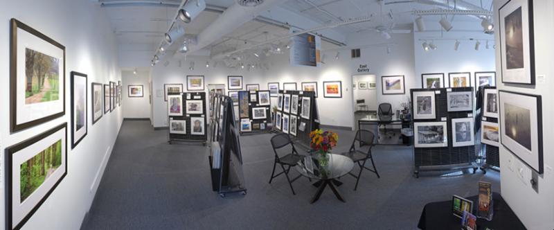
The NOTA Project -- An Exhibit by Steve Malloy Desormeaux, Gil Maker, Don Menges, John Solberg, and George Wallace | | Current Show Runs Through Sunday, November 2 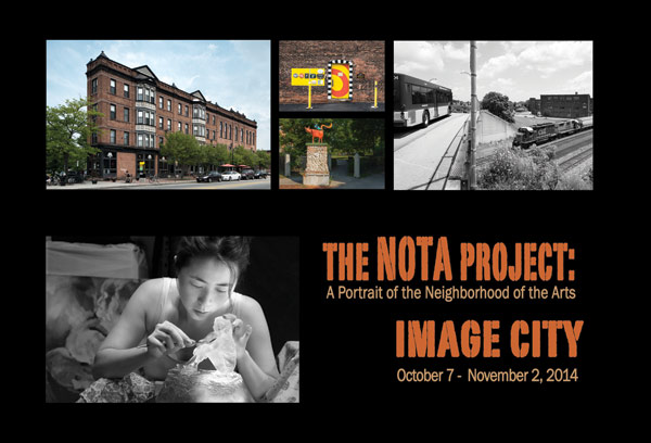 Our current exhibit is The NOTA Project and features the photography of Gil Maker, Steve Malloy Desormeaux, Don Menges, John Solberg, and George Wallace. The NOTA Project is a collaborative effort of the five area photographers who have been working with Bruno Chalifour, local photographer and educator, as mentor. After several months studying and critiquing each other's images, Bruno suggested that they explore and photographically interpret the same geographic area so that they could compare and contrast each other's work. Rochester's Neighborhood of the Arts became their target. The images you will see are a sample of several hundred images that represent this project. Our current exhibit is The NOTA Project and features the photography of Gil Maker, Steve Malloy Desormeaux, Don Menges, John Solberg, and George Wallace. The NOTA Project is a collaborative effort of the five area photographers who have been working with Bruno Chalifour, local photographer and educator, as mentor. After several months studying and critiquing each other's images, Bruno suggested that they explore and photographically interpret the same geographic area so that they could compare and contrast each other's work. Rochester's Neighborhood of the Arts became their target. The images you will see are a sample of several hundred images that represent this project.
The exhibit will also include photography by Guest Photographers Jane Hopkins in the East Gallery and Paul Drushler, Lou Ryen, and Hiatt Zhao. Additionally, photographers with award-winning photographs from Camera Rochester competitions by Cheryl Challenger, Ron Gouger, John A. Ejaife, Stanley Hattman, Michelle Turner, and George Wallace. Gallery Partners also exhibiting are Dick Bennett, Carl Crumley, Steve Levinson, Dan Neuberger, Betsy Phillips, Gary Thompson, Phyllis Thompson, and Sheridan Vincent, as well as Artists-in-Residence, Jim Patton and David Perlman.
Click Here to see a preview on our website of a selection of photographs from the exhibit. There is no admission fee at Image City and is accessible to all. |
| The Magic of Light 2015 -- Call for Submissions | | Photographer's Exhibit January 2015
Dear Friends of Image City Photography Gallery,
We very much appreciate the participations of photographers who answer our calls for submissions for our juried exhibits. Remember that you can enter more than once.The modest contributions from the entry fees help us cover our Gallery expenses and sustain the operations at Image City. After eight successful editions of our annual juried show, we are pleased, to let you know that there will certainly be another. The theme of the 2015 Image City Juried Theme Show is again titled The Magic of Light. The theme is open, to give you freedom to create astonishing pictures. The exhibit of selected photographs will be in January 2015 at Image City.You can find all details for your submission at the special link: The Magic of Light 2015 Call Page. The same information is also available via the Image City Website. If you have any question, please feel free to contact me at Gilbert.Maker@ImageCityPhotographyGallery.com or by phone at 585-271-2540. All Gallery Partners look forward to receiving your submission by November 16, 2014 even better, if we receive it before October 26, 2014 - see details on the link above.
Feel free to forward this announcement to any of your friends and relatives who might be interested in participating in the Image City Juried Show, The Magic of Light 2015. Gilbert Maker, Gallery Partner Chairman of the 2015 Juried Show at Image City. |
| Peter Marr's Picks of the Show by the Featured Photographers | |
We are very fortunate to have Peter Marr, photographer, competition judge, and past president of the Kodak Camera Club, select his "picks" by the featured artists in the show after a very careful critical review. We enjoy the added feature he brings to the exhibit by way of an enlightening review of the chosen photo and with his thoughts on what attracted him to it. We publish his comments with the photo in the exhibit and online, as well as in the newsletter. We very much appreciate Peter's contributions. Peter picked five photos from the exhibit and his commentary follows. They are also posted onlne, click here. Art and an Oil Change #3 by Steve Malloy Desormeaux 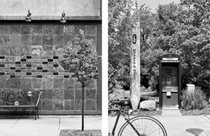 All of Steve's dramatic and thought provoking prints, have two separated and diverse images, where the division between them is clear cut, except for numbers 1 and 8, where the separations are real, and an important element in each photograph. For the viewer of these striking and powerful images, I would hope that they do not try to envisage what the artist had in mind when he deliberately juxtaposed two different scenes, but instead, carefully study the prints and try and see what they really convey to them. I was especially drawn to #3, for, despite the many similarities and differences between the two images, there is a fascinating and compelling unison when one studies them side by side. There is a distinctive commonality of vertical and horizontal lines which relate to stability and formality, and this is offset by the strong abstract connection between the modern, artistically designed half-bench, and the more conventional half of a stationary bicycle. There is a charming relationship with the multi-treed presence in the right-hand print, reprised by the lone single-tree standard in the left-hand print, both offering a defining statement in support of the neighborhood. Although both prints are creatively vertical, the curved designs of the bench and the two spotlights, integrate harmoniously with the bicycle wheel and the curved features inside the telephone booth. For myself, the dramatic interplay between the two images is not just a question of the old versus the new evolving side by side, it is more about harmony and the rapport that each picture has with each other. At any time I can actively engage in the right-hand print, explore the phone booth, visit the "Writers and Books" venue, and then, when I feel like a rest, I can bicycle in my mind across to the left print to both admire the artistry and relax on the bench and commune with nature through the solitary tree. In summary, Steve has aesthetically given us two wonderful prints in which I can actively partake in both images, so that when I have tired of the excitement and challenges in one of them, I can travel to the other for rest and contemplation. All of Steve's dramatic and thought provoking prints, have two separated and diverse images, where the division between them is clear cut, except for numbers 1 and 8, where the separations are real, and an important element in each photograph. For the viewer of these striking and powerful images, I would hope that they do not try to envisage what the artist had in mind when he deliberately juxtaposed two different scenes, but instead, carefully study the prints and try and see what they really convey to them. I was especially drawn to #3, for, despite the many similarities and differences between the two images, there is a fascinating and compelling unison when one studies them side by side. There is a distinctive commonality of vertical and horizontal lines which relate to stability and formality, and this is offset by the strong abstract connection between the modern, artistically designed half-bench, and the more conventional half of a stationary bicycle. There is a charming relationship with the multi-treed presence in the right-hand print, reprised by the lone single-tree standard in the left-hand print, both offering a defining statement in support of the neighborhood. Although both prints are creatively vertical, the curved designs of the bench and the two spotlights, integrate harmoniously with the bicycle wheel and the curved features inside the telephone booth. For myself, the dramatic interplay between the two images is not just a question of the old versus the new evolving side by side, it is more about harmony and the rapport that each picture has with each other. At any time I can actively engage in the right-hand print, explore the phone booth, visit the "Writers and Books" venue, and then, when I feel like a rest, I can bicycle in my mind across to the left print to both admire the artistry and relax on the bench and commune with nature through the solitary tree. In summary, Steve has aesthetically given us two wonderful prints in which I can actively partake in both images, so that when I have tired of the excitement and challenges in one of them, I can travel to the other for rest and contemplation.
NOTA #3 by Gil Maker 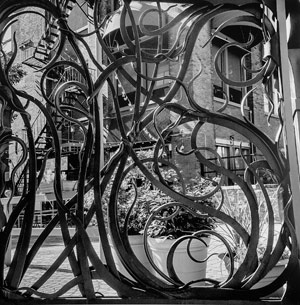 Of all of Gil's excellent and enlightened B/W prints, NOTA #3 had a profound effect on me, especially as it beautifully illustrates the diversity that is so commonplace in the NOTA neighborhood, particularly with reference to the old versus the new. In the background, one sees a very large building, a less than inspiring vertical scape of brick and steel, home over countless years to a variety of tenants and businesses. Currently, it appears that the lower floor is home to a Mall entrance and to a restaurant, the presence of both of them being advertised by a string of unsightly lights. Residents of the upper floors have the necessary pleasure of having an enormous fire escape that dominates the left hand side of the building. In the foreground of this unspectacular setting is an open brick-like tiled courtyard, with at least a semblance of some design qualities in the curved portion at the bottom left. The last viewable, hideous detail, is the mandatory array of potted plants, somehow surviving in nondescript pots. Having set the tone for an unremarkable area, Gil's print makes a stunning transition, attributed to the fact that the whole scene is photographed and captured through the framework of the most elegant and artistic gate that one could imagine, namely, an Albert Paley masterpiece. The internationally renowned metal worker has created a sculptured edifice of flowing carved steel designs, with twists and elegant formations that are so beautiful as they are magnificent. For myself, I cannot help wondering if this massive awe-inspiring gate is an entrance to an area that we cannot see, or a barrier so that one cannot trespass or want to go to the building area that one sees beyond. In conclusion, Gil has creatively seen and photographed this NOTA area, resulting in a visionary print that I am sure he is very proud of, and everyone should congratulate him for such an insightful image. Of all of Gil's excellent and enlightened B/W prints, NOTA #3 had a profound effect on me, especially as it beautifully illustrates the diversity that is so commonplace in the NOTA neighborhood, particularly with reference to the old versus the new. In the background, one sees a very large building, a less than inspiring vertical scape of brick and steel, home over countless years to a variety of tenants and businesses. Currently, it appears that the lower floor is home to a Mall entrance and to a restaurant, the presence of both of them being advertised by a string of unsightly lights. Residents of the upper floors have the necessary pleasure of having an enormous fire escape that dominates the left hand side of the building. In the foreground of this unspectacular setting is an open brick-like tiled courtyard, with at least a semblance of some design qualities in the curved portion at the bottom left. The last viewable, hideous detail, is the mandatory array of potted plants, somehow surviving in nondescript pots. Having set the tone for an unremarkable area, Gil's print makes a stunning transition, attributed to the fact that the whole scene is photographed and captured through the framework of the most elegant and artistic gate that one could imagine, namely, an Albert Paley masterpiece. The internationally renowned metal worker has created a sculptured edifice of flowing carved steel designs, with twists and elegant formations that are so beautiful as they are magnificent. For myself, I cannot help wondering if this massive awe-inspiring gate is an entrance to an area that we cannot see, or a barrier so that one cannot trespass or want to go to the building area that one sees beyond. In conclusion, Gil has creatively seen and photographed this NOTA area, resulting in a visionary print that I am sure he is very proud of, and everyone should congratulate him for such an insightful image.
740 University Ave by Don Menges 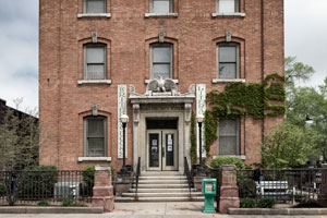 In a series of outstanding color prints, Don has given the viewer a remarkable opportunity to explore the incredible diversity of buildings that front University Ave, where the prolific variety of both architecture and design features, directly relates to striking changes in the neighborhood over the last fifty years or so. In all of these prints, I wanted to visualize what some of these changes were, so what better than to choose "740 University Ave," a building that definitely has had a major change in occupancy. Firstly, I admire the way that Don as captured this beautiful building in a horizontal rather than a vertical format, so that one can focus intently on the imposing central entranceway. All of us can immerse ourselves in this print, and picture what could have transpired when #740 was the home of the 3rd Precinct Police Station. The latter name is boldly and proudly emblazoned above the main doorway, an entrance which also displays distinctive architectural components, including an eagle edifice over the door. It is not too difficult to visualize that there was a considerable time when this station was a hive of activity, 24 hours a day, and seven days a week, particularly through the prohibition and depression eras. One should then pause and question when and why this station was closed down, perhaps it may have been the centralization of the police force, or the expense of modernizing this building. What has definitely happened is that it is the end of a fabled era, and the birth of another one, where the dramatic change of occupancy is from a dwelling of extensive physical activity and high noise level into the peace and calm of the "Writers and Books Literary Center." The current owners are very fortunate to occupy such a delightful and historic building, and we are deeply indebted to Don for this lovely print, which truly illustrates the old and the new changes in the NOTA neighborhood. In a series of outstanding color prints, Don has given the viewer a remarkable opportunity to explore the incredible diversity of buildings that front University Ave, where the prolific variety of both architecture and design features, directly relates to striking changes in the neighborhood over the last fifty years or so. In all of these prints, I wanted to visualize what some of these changes were, so what better than to choose "740 University Ave," a building that definitely has had a major change in occupancy. Firstly, I admire the way that Don as captured this beautiful building in a horizontal rather than a vertical format, so that one can focus intently on the imposing central entranceway. All of us can immerse ourselves in this print, and picture what could have transpired when #740 was the home of the 3rd Precinct Police Station. The latter name is boldly and proudly emblazoned above the main doorway, an entrance which also displays distinctive architectural components, including an eagle edifice over the door. It is not too difficult to visualize that there was a considerable time when this station was a hive of activity, 24 hours a day, and seven days a week, particularly through the prohibition and depression eras. One should then pause and question when and why this station was closed down, perhaps it may have been the centralization of the police force, or the expense of modernizing this building. What has definitely happened is that it is the end of a fabled era, and the birth of another one, where the dramatic change of occupancy is from a dwelling of extensive physical activity and high noise level into the peace and calm of the "Writers and Books Literary Center." The current owners are very fortunate to occupy such a delightful and historic building, and we are deeply indebted to Don for this lovely print, which truly illustrates the old and the new changes in the NOTA neighborhood.
Steve Carpenter by John Solberg 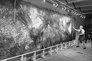 John's impressive series of prints of artists at work in their studios, is a great tribute to the countless hours that he spent with each artist, resulting in images that have a magic and intimacy that is unsurpassed. The prints are creatively presented in B/W, a media that is so uplifting for the subject matter. My favorite image, Steve Carpenter, has movement and a dynamism that is just exhilarating, depicting an artist really at one with the painting, exuding a passion and excitement that is just remarkable. One might argue that this enthusiasm is because the piece is almost complete, but I certainly beg to differ. One is immediately struck by the vast scale of the project, for the very large canvas virtually dwarfs the artist, and I imagine that keeping everything in perspective must be a great challenge. The more that one studies this striking mural, other salient questions come to mind. For example, was this a commissioned project?, and if so, what freedom did Steve have in the design and content in order to fulfill the client's wishes? Without personally viewing the piece, my inclination is that one is witnessing a forest scene in which a riderless horse is charging through a glade of trees, but of course this is pure speculation. John has created a strong visual statement by including a large area of the concrete floor. The starkness and coldness of this large area to me, represents a bleak, empty canvas, which in time, has been brilliantly transformed into the masterpiece that Steve is in the process of completing. I hope that eventually many of us will be able to view this exciting work of art, but at this time, our reward is to study John's powerful print, an example of creative photography at its very best. John's impressive series of prints of artists at work in their studios, is a great tribute to the countless hours that he spent with each artist, resulting in images that have a magic and intimacy that is unsurpassed. The prints are creatively presented in B/W, a media that is so uplifting for the subject matter. My favorite image, Steve Carpenter, has movement and a dynamism that is just exhilarating, depicting an artist really at one with the painting, exuding a passion and excitement that is just remarkable. One might argue that this enthusiasm is because the piece is almost complete, but I certainly beg to differ. One is immediately struck by the vast scale of the project, for the very large canvas virtually dwarfs the artist, and I imagine that keeping everything in perspective must be a great challenge. The more that one studies this striking mural, other salient questions come to mind. For example, was this a commissioned project?, and if so, what freedom did Steve have in the design and content in order to fulfill the client's wishes? Without personally viewing the piece, my inclination is that one is witnessing a forest scene in which a riderless horse is charging through a glade of trees, but of course this is pure speculation. John has created a strong visual statement by including a large area of the concrete floor. The starkness and coldness of this large area to me, represents a bleak, empty canvas, which in time, has been brilliantly transformed into the masterpiece that Steve is in the process of completing. I hope that eventually many of us will be able to view this exciting work of art, but at this time, our reward is to study John's powerful print, an example of creative photography at its very best.
Steve Carpenter's Studio by George Wallace 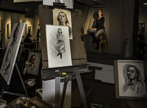 George, as always, has on display a series of inspiring and poignant prints of the NOTA neighborhood, that encompasses environmental and social portraits, both inside and outside various venues in this very diverse area. What I truly admire about this "Studio" setting, is the incredible feeling of quietness, coupled with the sensation of intense activity, an area where originality and artistic skills are honed to perfection. George has certainly used his artistic seeing skills to create a strong visual statement. What I respect and appreciate in this studio, is that at this time, there is very little influence from the outside world, allowing each artist to experiment and explore, and expand on their artistic talents in any direction that they would like to go. The author has superbly captured the intensity and atmosphere by the way he has handled the subdued lighting, in a way that highlights every important feature for maximum effectiveness. The print masterfully captures the model seated on a simple wooden high chair, yet carefully allows the viewer to enter and admire the various portraits imposingly displayed on easels in the foreground, and on walls in the background. George, to his visionary credit, has cleverly captured the whole essence of a very active art studio, whilst carefully not highlighting any of the artists themselves, only showing examples of their work to show their diversity of artistic talents. Left to the imagination is the presence of the resident artist and Studio owner, namely, Steve Carpenter. I am certain that his critiques and encouragement for each artist is very much an important part of this setting. What I really admire in this print is that George has creatively captured a magical moment, and given us a stellar image for everyone to enjoy and comment on if they so desire. George, as always, has on display a series of inspiring and poignant prints of the NOTA neighborhood, that encompasses environmental and social portraits, both inside and outside various venues in this very diverse area. What I truly admire about this "Studio" setting, is the incredible feeling of quietness, coupled with the sensation of intense activity, an area where originality and artistic skills are honed to perfection. George has certainly used his artistic seeing skills to create a strong visual statement. What I respect and appreciate in this studio, is that at this time, there is very little influence from the outside world, allowing each artist to experiment and explore, and expand on their artistic talents in any direction that they would like to go. The author has superbly captured the intensity and atmosphere by the way he has handled the subdued lighting, in a way that highlights every important feature for maximum effectiveness. The print masterfully captures the model seated on a simple wooden high chair, yet carefully allows the viewer to enter and admire the various portraits imposingly displayed on easels in the foreground, and on walls in the background. George, to his visionary credit, has cleverly captured the whole essence of a very active art studio, whilst carefully not highlighting any of the artists themselves, only showing examples of their work to show their diversity of artistic talents. Left to the imagination is the presence of the resident artist and Studio owner, namely, Steve Carpenter. I am certain that his critiques and encouragement for each artist is very much an important part of this setting. What I really admire in this print is that George has creatively captured a magical moment, and given us a stellar image for everyone to enjoy and comment on if they so desire.
|
| Gallery Partner Picks of Photographs by the Guest Photographers | | In addition to Peter's Picks, Gallery Partners have called out three additional photographs by our Guest Photographers in the exhibit. They are also posted online, click here. Skeleton Mandala
by Jane Hopkins 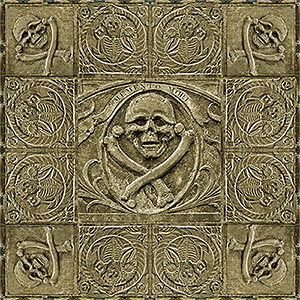 The Skeleton Mandala is a mosaic of images assembled with striking symmetry and balance from photographs taken in Massachusetts and South Carolina. The Skeleton Mandala is a mosaic of images assembled with striking symmetry and balance from photographs taken in Massachusetts and South Carolina.
The theme MEMENTO MORI ("Remember that you will die") is the banner above the central skull, and the skull is echoed in the four corners. The two skeleton-snake carvings along each side are reflections of each other and complete the mandala circularity. Not only do the mosaic images work effectively together, but the mandala has been constructed with such skill that it could be mistaken for a single carving. The colors, tone, and shading, the edge along the outside, the seamless joining of the many elements tie them together into a single whole.
Reflection on the Danube
by Lou Ryen
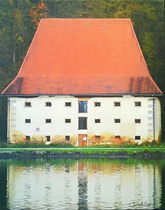 Lou Ryen is an accomplished photographer who has traveled the world and shown his work in many locations in Rochester and around the world. He is exhibiting nine vivid images from Germany, France and the local area. His Reflection on the Danube stands out in this presentation. The Danube is Europe's second longest river and passes through or touches ten countries and four capital cities on its way from the Black Forest in Germany to its delta in the Black Sea area of Ukraine and Romania. Once a long-standing frontier of the Roman Empire, the Danube has been the scene of important battles, travel by ocean vessels, a major link for economic transport and dazzling vistas of major cities along its route. Yet, Lou has decided to capture the Danube with a single building and its reflection on the serene Danube River. The simple structure of a rectangular building and a trapezoidal roof bespeak a rural life style of dedicated and hard working artisans and farmers. The red of the roof is striking yet it is the reflection, which Lou directs us to view. He selectively suggests that the rectangular lower portion of the house is the focus of his photography. Rather than a shimmering reflection in the water, the treatment of this image on canvas further emphasizes the rusted and faded whites and colors of the main part of the house. The lack of context within the photo leads the viewer to wonder where this building is located and what it is used for. The simple three-story structure has none of the accoutrements of a house such as a garden or curtains in the windows. Neither does it appear, at first glance, to be a factory. Perhaps an inn or rooming house. Lou's choice of this particular building reminds us that even in the most robust and populated areas of the world there also exists mystery, simplicity, serenity and symmetry to life. Lou Ryen is an accomplished photographer who has traveled the world and shown his work in many locations in Rochester and around the world. He is exhibiting nine vivid images from Germany, France and the local area. His Reflection on the Danube stands out in this presentation. The Danube is Europe's second longest river and passes through or touches ten countries and four capital cities on its way from the Black Forest in Germany to its delta in the Black Sea area of Ukraine and Romania. Once a long-standing frontier of the Roman Empire, the Danube has been the scene of important battles, travel by ocean vessels, a major link for economic transport and dazzling vistas of major cities along its route. Yet, Lou has decided to capture the Danube with a single building and its reflection on the serene Danube River. The simple structure of a rectangular building and a trapezoidal roof bespeak a rural life style of dedicated and hard working artisans and farmers. The red of the roof is striking yet it is the reflection, which Lou directs us to view. He selectively suggests that the rectangular lower portion of the house is the focus of his photography. Rather than a shimmering reflection in the water, the treatment of this image on canvas further emphasizes the rusted and faded whites and colors of the main part of the house. The lack of context within the photo leads the viewer to wonder where this building is located and what it is used for. The simple three-story structure has none of the accoutrements of a house such as a garden or curtains in the windows. Neither does it appear, at first glance, to be a factory. Perhaps an inn or rooming house. Lou's choice of this particular building reminds us that even in the most robust and populated areas of the world there also exists mystery, simplicity, serenity and symmetry to life.
Houston (Geometric)
by Hiatt Zhao 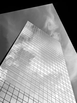 Hiatt has combined some very interesting techniques to create a structured abstract image. Using wonderful geometric patterns consisting of triangles, squares, rectangles, and more triangles, Hiatt has taken photographic license to position himself in such a way that the angle of this image is impossible, yet the structure remains solid. The sky and its reflection are the final components that bring reality to this abstract. This image confuses the viewer at first, while the recognizable elements urge you to continue studying the image to find the connection. The angles are sharp and determined, then the sky and clouds soften the impact and you begin to focus and finally recognize the subject. Well seen. Well composed! Hiatt has combined some very interesting techniques to create a structured abstract image. Using wonderful geometric patterns consisting of triangles, squares, rectangles, and more triangles, Hiatt has taken photographic license to position himself in such a way that the angle of this image is impossible, yet the structure remains solid. The sky and its reflection are the final components that bring reality to this abstract. This image confuses the viewer at first, while the recognizable elements urge you to continue studying the image to find the connection. The angles are sharp and determined, then the sky and clouds soften the impact and you begin to focus and finally recognize the subject. Well seen. Well composed!
|
| Image City Critiques Meeting: Next is November 5 | | The Image City Critique Group meets the first Wednesday of the month. Participants meet and review images that they bring to a friendly critiquing session. We will meet on Wednesday, November 5th at 7pm at the Gallery. The assignment for November is to submit 3-5 images employing a selective focus technique. Many times this is used for nature shots, flowers in particular, but think past that and be creative. Not that flower shots are forbidden!. You are not allowed to create your images via software. Do it with your camera. Try several different f-stops and angles to get the desired effect you are after. Send your image files to Don Menges dmenges@rochester.rr.com so they can be set up for the meeting. |
| Calendar of Events | | Image City Photography Gallery, 722 University Avenue October 26 Reduced entry fee ends for submissions to The Magic of Light 2015 Juried Show
November 2 Last Day of Current Exhibit -- The NOTA Project November 4 Opening Day for the next Exhibit - The B&W Invitational November 5 Image City Critiques Meeting, 7pm. November 7 Opening Reception and First Friday Gallery Night 5-9pm for The B&W Invitational November 16 Last day for submissions to The Magic of Light 2015 Juried Show Image City Photography Gallery Hours: Tuesday - Saturday, Noon - 6 Sunday, Noon - 4 There is no admission fee to visit Image City Photography Gallery |
| Contact Information | | Image City Photography Gallery, 722 University Avenue, Rochester, NY 14607 In the Heart of ARTWalk in the Neighborhood of the Arts |
| | |
|