![]()
Gallery Photographers
Partner
Artists-in-Residence
If you are unable to visit our gallery and would like to purchase photographs from this preview or others in the gallery, please contact the gallery and call 585-271-2540.
Peter Marr's and Partners' Picks of the Show
Some of My FavoritesDan Neuberger
Peter Marr
and Gallery Partners have chosen their "Picks of the Show"
and
present a commentary on their choices.
click here to return to the details of the exhibit
All images copyright by the individual photographers
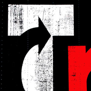
Homage to Alexander Calder #1
by Dan Neuberger
I
have a habit of choosing the image used illustratively on the cards used
to advertise the exhibitions as one of my “picks”, and this is no
exception. All of Dan’s Alexander Calder prints are exhilarating and
very meaningful, but I can only choose one, so I selected #1, which by
the way, is one of my all-time favorite images created by Dan. The large
print is electrifyingly dynamic and inspiring; I just wish that Calder
could have seen it in person, for I am sure that he would have been
justly proud to be honored in this way for his brilliant art. For
creative impact, this authoritative graphic design is imaginatively
inspiring. I cannot imagine anyone who would not be impressed by this
print, even though they may not all understand why they like and admire
it so much. For myself, the sheer boldness and starkness of the B/W
design is both imposing and uplifting, and the inspired addition of the
red element is both aesthetic and visionary. Unlike attempting to
understand what an artist like Mark Rothko intended in many of his bold,
graphic pieces, here, the author has given us a strong, daring motif,
uniquely selected from a large sign that was stamped on a container,
resulting in an abstract graphic work of art. Definitely, the black
arrow powerfully curving across the center of the print is the dominant
feature that the eye is attracted to, and this is mirrored in part by
the red element, which strikingly suggests a smaller red arrow,
curtailed by the confines of the print. Many people will visualize a
giant white T against a jet black background, whilst puzzling about the
significance of the mysterious scratches, etchings and vertical lines of
bolts that are clearly evident. I do not think that one is meant to
intently analyze this, or any of the other images Dan has artfully
constructed in homage to Calder. I admire this print, and the four
others for their dramatic, awesome impact and design, for their inspired
use of red, black and white, and for the genius of the author who has
carefully and artistically selected these inspiring segments.
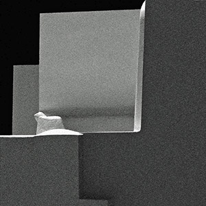
Santorini Planes
Visiting
the magical islands of Greece, one is captivated by the blaze of
saturated hues, set against the pure white buildings and an ever-present
brilliant blue sky, and where the sun impressively details breathtaking
scenic splendors. Many of Dan’s outstanding prints in this exhibition
are in full color, but many are in black and white, a media he has used
artistically, to fully reveal the architectural beauty of Santorini to
its fullest. Confucius so eloquently stated that “Everything has its
beauty, but not everyone sees it,” but in his wonderful achromatic
print, SANTORINI PLANES, Dan
has given us a creative, stellar image, that every viewer cannot fail to
be entranced and captivated by. The elimination of color gives a
stronger sense of light and shadow, and the tonal contrasts emphasize
the shapes dramatically. The gray scale gradations are superb,
wonderfully illustrating the architectural beauty of shape and form,
taking Ansel Adam’s zone system to the ultimate stage of perfection. The
bold, dynamic design elements from the purest white to the darkest
black, all contribute to an electrifying, almost abstract image that is
very powerful and endearingly beautiful. I say almost abstract, because
it is not too difficult to imagine that the white element in the left
center could easily represent some animal form. Tantalizingly, there is
also a step, albeit stairless, and a vertical rise that leads up to this
figure. The presence of a non-linear design, especially as it has the
highest luminance level may trouble some viewers, especially those with
digital removal expertise. I am glad that the author did not attempt to
follow this path. The end result is a dramatic, compelling print, where
the fusion of eye catching gray scales has been exquisitely captured, to
reveal a architectural masterpiece of incomparable majesty and power.
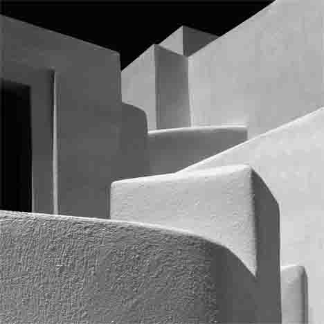
Angles and Planes in
Santorini by Dan Neuberger Bigger is certainly by no means better in a vast
number of works of art, but here, in this extraction of intimate detail
from a much larger “canvas”, the large print certainly adds heightened
drama, and increases the impact of the graphic abstraction immensely.
This building complex is an architectural gem in its own right, but by
compressing the shapes, lines and angles, we end up with a superb,
distinctive and incisive design, which owes its resplendence to the
author’s creative, artistic vision, and the astute use of soft and not
harsh lighting, the latter being very prevalent throughout the Greek
islands. The exquisite lighting dramatically highlights every salient
feature, including the white stucco detail of the walls. The eye easily
makes a joyful tracery in and out of each imposing structure,
effortlessly traversing hidden stairs and ramps. The subtle tonal
gradations, essential for the delineation of each wall and facade have
been masterfully captured and recorded. The negative space of black sky,
artfully carved from the distinctive lines and angles at the top of the
structures, is mirrored almost exactly in content, not form, by the open
doorway at the extreme left. The surface composition of the stucco in
the foreground is fascinating in its relief detail, definition which
diminishes as we move up the structures, but it is still evident enough
to clearly delineate every architectural feature. Although we have no
definite sense of scale, we know that we are admiring an exciting and
beautiful segment from one of the most picturesque scenic areas of the
enchanting Santorini. Dan has captured, printed and presented us with an
outstanding, unforgettable image, one that could be proudly displayed in
anyone’s home for all to admire.
Peter A. Marr
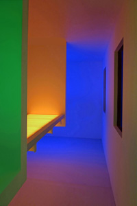
Shapes, Light, & Color #4
This
scintillating exhibition is an awesome tribute to the artistic vision,
versatility and breathtaking talents of Dan. I am proud to say with
absolute sincerity, that he is the most gifted and creative photographer
that I have ever known. Dan has the tenacity and strength to let go of
certainties and explore new concepts with amazing success.
The 7 pieces that are expressively titled
Shapes, Light, and Color form a dazzling display of futuristic
designs and electrifying colors that have uplifting impact and radiance,
both individually, and as a combined group. I chose #4 to comment
further on, because not only is it my favorite image, it is the one that
I wanted to explore in greater depth beyond the initial impact. The
range of vibrant, saturated hues are extraordinary, with seemingly every
color of the rainbow represented, and together with the authoritative
linear design features, the end result is a truly stellar image. The
techniques used to create the latter, are a great tribute to the
author’s masterly expertise and creativeness. Dan wants to pull us into
a more intimate relationship with our thoughts and feelings, so it is
pertinent to ask the viewer what the photograph emotionally says or
offers. For myself, I am very much aware that I am in a Tanning Booth,
completely relaxed and at one with the world and my surroundings,
allowing my subconscious to dictate all of my thoughts and feelings.
Under the warmth of the UV radiation, and in the confined space of
vertical and linear elements, there is an overwhelming impression of
brilliant, joyously varied colors, devoid of blacks and whites. One
experiences an almost psychedelic enthusiasm, with no human intrusion or
encounter. The overall intense awareness is of trying to savor every
precious moment, whilst being aware that there is a finite time limit,
controlled by someone turning the lights off, and a voice telling me
that my time was up. An out of this world experience that I will never
forget
Peter A. Marr
Dahlia Two Welcoming spring, and its long anticipated
arrival, this exhibit of work by Mary Ellen displays the beauty of
flowers. Her photographs are not merely straight representations of
flowers, the kind we might see in a seed catalog, but creations
which resonate with the viewer. Composition is a strong part of
Dahlia Two, as well as her other photographs.
The flower dominates the top left-hand part of the photograph leaving
much room for a mystical surround. The pastel feel of the photograph is
strongly reinforced by her choice of printing on a canvas stock rather
than a conventional paper. Several people have commented that her
photographs are the perfect kind to be mated with a canvas display.
The flower almost cascades downward like a heavy drape, but with a very
delicate flow. One could almost say that the photograph of this flower
is somewhat analogous to a soft focus beautifully composed boudoir
photograph of a woman draped in a transparent robe.
The combination of a strong graphic composition, a novel view of a
flower, the muted colors and canvas presentation make this photograph a
reminder how a skilled photographer can start with a beautiful flower
and add their creativity to produce art which anyone would love to
display in their home.
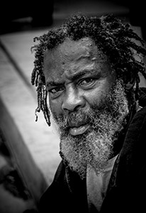
Man
Jim
has captured a powerful portrait of a distressed man. The intense look
on the subject's face expresses everything from distrust to anger,
perhaps even hatred. The forehead furrows and scarred face provide
evidence of a very tough life.
This excellent portrait contains all the ingredients of an excellent B&W
print. The darkest tones are pitch black and strong contrast enhances
the man’s aggressive appearance. The highlights have good definition
without blow-out and the shadow areas frame the detailed features of the
man. His scruffy beard adds to his rugged appearance and his braided
hair against a white background adds mystery to his character. The
haunting intense look in his eyes is focused directly on the viewer of
the image.
Based on his appearance, many different
scenarios could be speculated about this man’s life.
All of the most logical possibilities would involve the man’s
toughness, competitiveness, ability to survive, and pride. Jim’s superb
photograph titled Man truly captures the character of its subject.
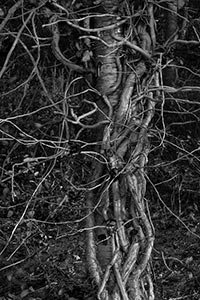
Till Death Do Us Part
One of the marks of the creative photographer is seeing beauty and art
in everyday things. Betsy Phillips frequently uses these kinds of
subjects to create her strong abstract photographs. This exhibit is both
a departure from the typical subjects she has shown at this gallery over
the years and at the same time is totally consistent with these
previously exhibited images.
Till Death Do Us Part
presents a photograph which allows the viewer to ponder relationships,
be they between people, animals or in this case two trees growing
intertwined almost producing a single entity. Betsy uses the interplay
of shadows and forms as well as the medium of black-and-white
photography to present this metaphorical image. All of the photographs
in this exhibit have an even stronger impact as they have been printed
in a much larger size.
Peter
Marr's Picks
by Dan Neuberger
by Dan
Neuberger
Peter Marr
We are very grateful to Peter for his thorough review and selection for Peter's Picks. Peter was born in England in 1935 and came to live in the United States in 1968. He worked for the Eastman Kodak Company for 34 years, retiring in 1998. During his employment and continuing into retirement, he has been an enthusiastic photographer. His photography has won him numerous awards throughout Kodak and in International Salons, including 5 George Eastman Medals, which is the top honor awarded to the most outstanding picture in the Annual Kodak International Salon. He has served as a judge in both local and international photographic competitions for the past 20 years, and is a Past president of the Kodak Camera Club and past chairman of many of the Kodak Camera Club organizations. In the past five years or so, he has devoted his photographic skills and interest into nature photography, notably bird photography. His bird photography has been the subject of several one-person exhibits, the most recent being at Ding Darling NWR, in Sanibel, Florida, The Roger Tory Peterson Institute in Jamestown, New York, and at the Webster Public Library in Webster, NY.
Gallery Partners' Picks

by Mary Ellen Hill
by Jim O’Neill
by Betsy Phillips
We all frequently pass by trees, however most of the time we really
don’t see them. Trees, as with other parts of our environment, are often
taken for granted.
Image City Photography Gallery ♦ 722 University Avenue ♦ Rochester, NY 14607 ♦ 585.271.2540
In the heart of ARTWalk in the Neighborhood of the Arts